Why does the same colour look different in different places?
The simplest way we find to explain the differences in colour is to go down to your local PCWorld or Curry’s and look at the wall of TVs. They are all usually showing the same program or image, yet the variation in the colour between each screen is easy to see isn’t it? This is down the the independent colour space of each TV, so don’t trust the colour you are seeing on your screen to be exact, and certainly don’t trust that you’ll be able to emulate it’s appearance when you print it.
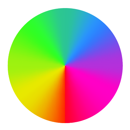
How to print the correct colour.
What is colour?
Simply put, colour is formed by light reflecting off a surface and hitting our eyes. White light contains the full spectrum of visible colours. Each colour has its own wavelength. We see the spectrum in a rainbow or on the cover of Dark Side of the Moon. Different objects reflect different wavelengths of light and so appear as different colours. For instance, grass looks green because it reflects green light while absorbing all other colours.
What is the RGB Colour Space?
RGB stands for the three primary colors of light: Red, Green and Blue. Colours in this space are created by mixing varying amounts of these three lights. TVs, monitors and digital cameras use RGB to simulate colours.
What is the CMYK Colour Space?
Cyan, Magenta and Yellow, together with Black, are the primary colours of pigments like inks and dyes. You will remember from primary school that mixing cyan (a blue) paint with yellow gives you green paint. Likewise blending cyan with magenta (a red/pink) results in purple.
The initials of Cyan, Magenta, Yellow and Key name the colour space. The key colour was traditionally added last to a printed picture to highlight fine details and border it with a keyline. Black was most commonly used and so found itself as the fourth process colour.
‘Process colours’ and the ‘four colour process’ are synonyms to describe printing using the four CMYK colours.
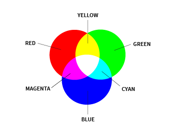
What is the difference between RGB and CMYK?
Both colour spaces exist to define recipes to reproduce colours. They take very different routes to get there though.
RGB is an additive system. Adding more and more colours as light leads you to a bright, white result. Switching off light/colour gives you darkness or black.
CMY(K) is by contrast subtractive. All the pigments on top of each other on a page would be black. Subtracting them would lead you back to blank, white paper.
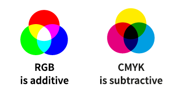
You have probably already spotted the problem here: one colour, red, with two recipes to create it. Those recipes also use completely different ingredients.
To make life harder, RGB is device independent, meaning there is no guarantee that the red on one screen looks the same as the red on another. Even though they are both using the same recipe, the final output will be different.
To make life even harder, the range (or gamut) of colours you can make from CMY(K) is narrower than with RGB. The RGB gamut reaches more colours which also tend to be more vibrant.
What is the solution?
How do you maintain consistant colours between screen and print?
What about between screens?
And how about between leaflets and signs?
There are some simple things you can do to help eliminate the possibilities of a colour not reproducing as expected:
- Calibrate your monitor. Give yourself confidence that what you’re are seeing on your screen is a true representation. Monitors sharing the same calibration set-up should display colours in a similar way.
- View your work on screen in good lighting, preferably against a neutral gray surrounding and background. Every bit of colour in your range of vision will interfere with your eyes’ interpretation of a colour.
- Try to make sure the software you are using is configured to match the settings used by your printer. Adobe software is shipped Worldwide and by default is configured to US standards. In Europe we print to a different baseline. Japan is different again.
- Perhaps the biggest thing you can do is make sure you’re designing your artwork in the CMYK colour space and not in RGB. If you use software like Microsoft Word and PowerPoint, you should be willing to accept that the printed colour will likely be nowhere near to how it displays on the screen. Those brightly coloured rainbow effects are going to reproduce quite flat and dull in relation to how you are seeing them on the screen.
- No, forget our last comment. The biggest thing you can do is manage your expectations, accept that the colour may reproduce differently to what you might think, embrace it and love the result we’re able to provide you with.
Is RGB or CMYK best for print?
RGB works on screens and so is the best model for designing websites, apps etc.
CMYK is designed to economically reproduce as many colours as possible on a surface.
CMYK is best for print.
Before we commit to printing thousands of copies of as job, we run a proof copy. This is a one-off print to check that all colours are correct as it is calibrated to the capabilities of our presses. We know that the finished job will be the same as the proof.
It is also useful as one last check of the content and spelling.
We can print a hard-copy proof for you to see and check you’re happy. You can even arrange to come in and press pass (basically see the print as it comes off the printer). Please tell us you’d like to do this at the time of placing your order. It is always best practice to ask for and check hard-copy proofs. These might seem like a cost at the start, but are peace of mind and priceless insurance against having to reprint due to an error.
If you have previously-printed jobs you’re happy with the colour on, then supply those to us at the beginning. We can colour shift and balance our prints to match them for you more closely than if we just ran to standards.
Remember, just because it’s been printed previously doesn’t mean that the colour on it is correct – things change over time, paper ages, sunlight has an effect too, but lets not get bogged down in all that yet!
Another way to improve consistency is to use one printer for all your print solutions.
Hopefully that’s us, but note that if you’re ordering flyers off the internet, business cards from us and you’re printing posters on your own desktop inkjet, the chances of those all reproducing the same colours is slim.
Still having colour worries?
There are more accurate models for representing colour such as the L*A*B* colour space.
LAB colour is seen as the most accurate way to represent a colour. It is independent to the monitor, camera or printer it is represented on and covers the entire range of human colour perception, or gamut.
You can very quickly get your mind blown and fall down a rabbit hole if you start investigating LAB colour, so our advice is know about it for sure, but leave it up to a professional artworker to worry about.
Pantone and other colour libraries.
Right, you’ve read all the rules, got everything set up as best you can, but the colour just isn’t reproducing correctly as it’s outside the gamut of any CMYK printer.
What do you do? Well that’s what Pantone colours (and other available libraries) are for. These are inks mixed to specific instructions by trained colour specialists.
Think of it as the paint colour charts in your DIY store – you see the colour you like, you pick it and it’s mixed as a special colour exactly as you want it.
Spot colours (or Pantone colours) are often used for corporate colours. For example; your logo uses a brilliantly bright orange. Printing that in CMYK would look dull and muted. You also need it to look the same across various printed materials such as brochures, packaging and vehicle graphics. Using a spot colour will give you the most consistent results, at a price of limiting the printing methods available.
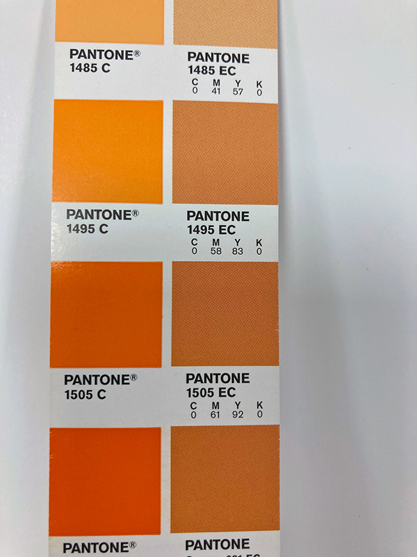
Oranges as spot colours from the Pantone library (left) and how they look when made up of CMYK process colours (right).
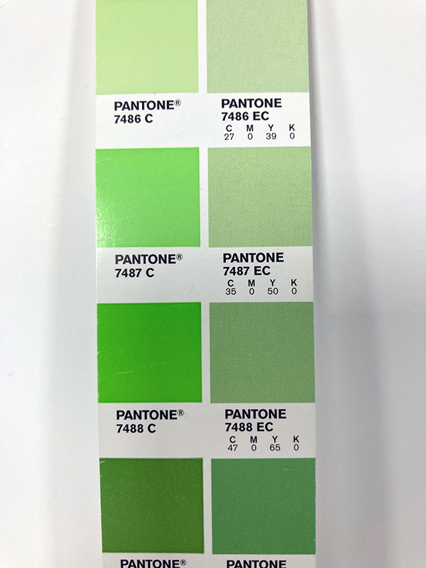
Greens as spot colours from the Pantone library (left) and how they look when made up of CMYK process colours (right).
Not all white is white.
(Also some blacks are blacker than others. We use 256 shades of grey. Nothing is easy is it?)
Not all papers have the same white point, so colour reproduction can be greatly effected by the material it’s being printed on. Putting it simply, it you print a yellow on white it will more than likely be bright and look quite pure. If you were to then print that same colour on a grey material the result would be much duller and muted.
Printing white on a coloured material.
We can circumvent the issue of printing onto darker, coloured materials by printing a white base prior to the CMYK inks being added. This is particularly advisable on window stickers that will appear washed out with out a white base to support the colours.
Metallics.
Like spot colours and Pantone colours, metallic effects printed using standard CMYK inks may look dull, dirty and very flat. Metallic inks are the solution.
If your heart is set on a nice gold type for your wedding stationery, then we would print it using a metallic gold ink. The same goes for silver or copper effects.
To get an even shinier result, we would use metallic foils, but that’s a subject entirely of its own.
If in doubt, ask.
The advise we’d give is, when seeking quotations, wherever possible supply the artwork to the studio first so they are able to analyse your files and assess your requirements.
Specify what you’re expecting and always compare all the quotes you receive like for like – a CMYK business card printed digitally will always be cheaper than a litho printed one which includes a spot colour and a gold foil, so beware: the cheapest isn’t always the best.
